What a Gun Violence Map Can Teach Us About Bad Decisions
What if I told you the most dangerous places in America aren’t big cities… but small rural counties? That’s exactly what a NBC News headline implies:
“Gun death rates are lower in cities than in rural counties.”
You can probably feel your brain lighting up already. Maybe you’re surprised. Maybe you’re skeptical. Maybe it fits something you already believe. Either way, your mind starts building a story around it.
And that’s the problem.
When Statistics Become Stories
This blog isn’t about gun policy. I’m not here to take sides.
I’m here to talk about how our brains get tricked by numbers, and how that can lead to bad decisions in any area of life.
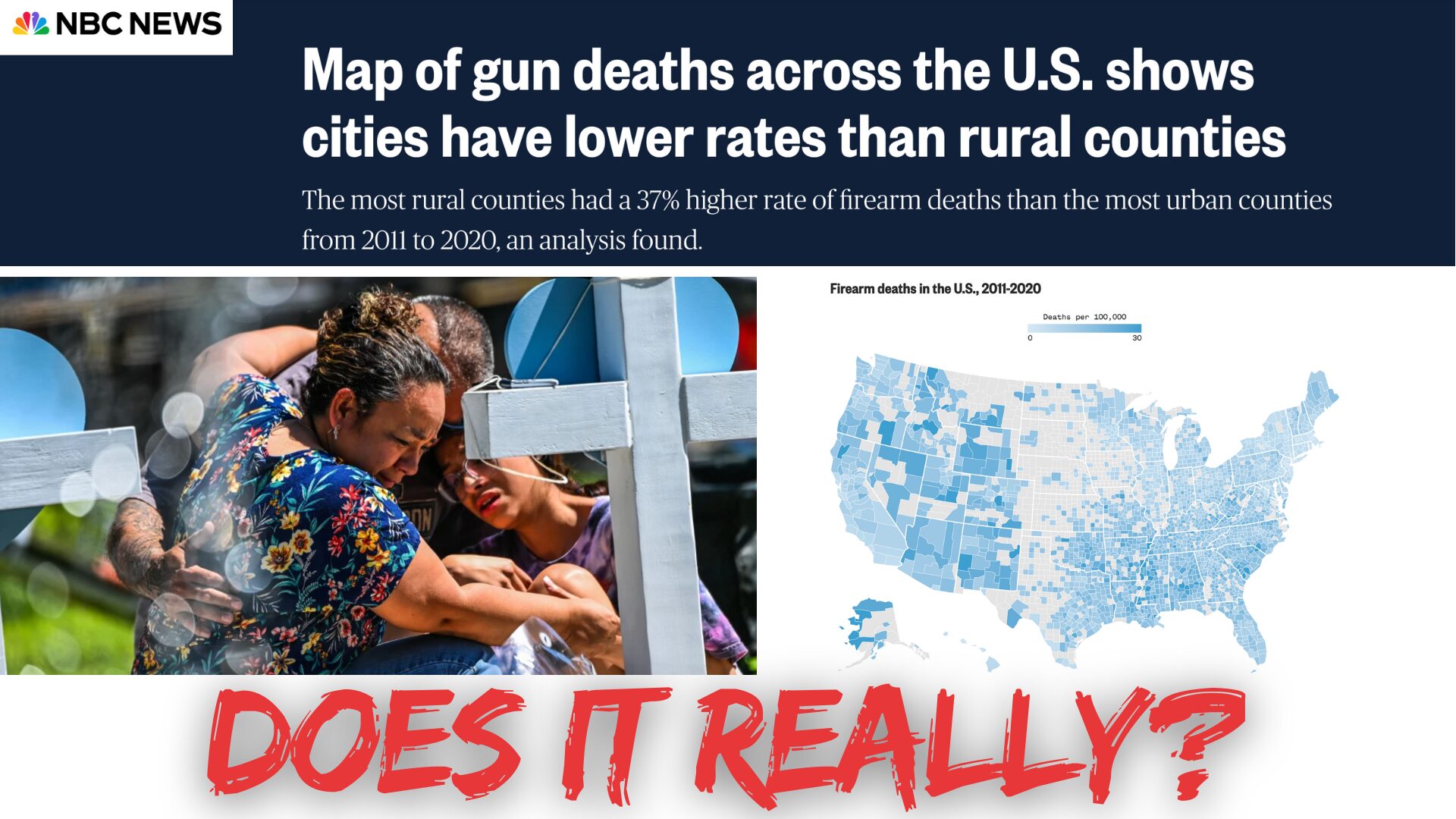
Let’s look closer at what the NBC article is based on: a real study published in JAMA Surgery in 2023. It found that rural counties have higher per-capita gun death rates than urban counties. On the surface, that seems pretty straightforward.
But here’s what the headline doesn’t highlight:
-
Although the NBC article eventually acknowledges it, the headline does not make it clear that the higher “gun death” rate in rural areas is mostly due to suicides, not homicides, a crucial distinction that only appears several paragraphs in.
-
In fact, homicide rates are 50% lower in the most rural counties compared to the most urban, meaning that by the common understanding of “danger” (threats from others), rural areas are actually safer.
-
Neither the NBC article nor the research paper examines whether the underlying suicide rate, regardless of gun use, is higher in rural counties overall. Instead, both imply that the presence of guns is the primary cause of the rural-urban gap, without fully exploring whether rural areas might naturally have higher baseline suicide rates for other social or economic reasons.
-
Small rural counties have tiny populations, which means a single incident can dramatically swing the “per capita” rate.
When you combine those facts, the story starts to shift. Maybe a lot.
That last point, about tiny populations, leads us straight into a thinking error called the Law of Small Numbers. And the NBC article’s map makes this crystal clear—if you look closely, you’ll notice that many rural counties don’t have a rate listed at all because the number of gun deaths was “too few to count.”
In other words: some of the highest and lowest firearm death rates on the map are in rural counties. That seems contradictory…how can the same type of place be both the safest and the most dangerous?
Because it’s not about the place. It’s about the math.
Small numbers are volatile. A single death in a tiny county can make its rate look extreme in either direction. This isn’t a hidden truth waiting to be uncovered. It’s what we should statistically expect when working with small populations, and it’s exactly what the Law of Small Numbers predicts.
The Law of Small Numbers (And Why It’s So Dangerous)
Here’s the trap: when we see numbers from small samples, like rural counties, we assume they reflect a real pattern. But they often don’t. The truth is, small samples are wildly volatile.
A few more deaths than usual? Suddenly, the county looks “dangerous.” A few less? Now it looks “safe.”
We think we’re seeing meaning. But often, we’re just seeing noise.
In the video below, I break down how this exact error shows up in cancer statistics, sales performance, and even marketing tests. It’s not just about public health. It’s about how we make decisions every day—and how easily we’re fooled.
🎥 [Watch the video to learn more — embedded below]
💥 The Lazy Brain: System 1 vs. System 2
Why does this happen?
Your brain runs on two systems:
-
System 1 is fast, emotional, intuitive. It sees a stat like “rural areas have more gun deaths” and immediately builds a story around it.
-
System 2 is slow, logical, and… kind of lazy. Unless we force it to engage, it usually just nods and goes along with the story System 1 created.
Worse, if that story aligns with what we already believe (thanks, confirmation bias), we’re even less likely to question it.
That’s a dangerous combo. Because when stories feel good, we stop thinking critically. And that’s when bad decisions happen.
I’ve put together a guide that explains 25+ other decision traps that you can download for free here. Or, if you want to learn more about the science behind System 1 and 2, check out this video. I promise, it will change the way you think about how you think.
🧱 What’s the Lesson Here?
This isn’t really about gun violence. It’s about how we interpret the world.
We read headlines. We see graphs. We hear statistics. And without realizing it, we leap to conclusions.
The smarter move?
Pause. Zoom out. Ask questions like:
-
How big is the sample size?
-
What’s actually being measured?
-
Are these categories really the same thing?
-
What story is my brain trying to tell me?
Most importantly: engage System 2. Use a structured decision-making process (like this) that helps you see the full picture—not just the part your gut likes.
💬 Final Thought
Next time you see a headline that confirms what you already believe… pause. Next time a stat makes you feel something… pause. Next time your team jumps on a “hot” new trend… pause.
Because in those moments, the Law of Small Numbers—and a dozen other brain glitches—are waiting.
And the decisions you make will only be as smart as your willingness to challenge them.
👉 Watch the video below to learn how to avoid these traps—and make decisions like a strategist, not a storyteller.